SuMemo
A conceptual mobile app focused on friendly UI, bite-sized learning, and intuitive AI interactions.
The Challenge
Learning a new language is hard, and many users lose motivation when faced with heavy, textbook-like apps. For the SuMemo MVP concept, my goal was to design a lighter, more engaging experience. The challenge was to combine two core features—AI-powered conversations and gamified progress tracking—into a clean, accessible mobile interface that keeps people motivated without overwhelming them.
01 — Understanding the Audience
To make the design practical, I focused on a specific audience: busy adults (18–40 y.o.) trying to fit learning into their daily routines.
These users don't have hours to study. I realized the UI had to be extremely respectful of their time. My main rule for this project: starting a lesson should take no more than 3 taps, and a session should easily fit into a 5-minute break.
Target Personas
Sophia (29, Marketing Specialist)
Liam (34, Stay-at-home Parent)
02 — Mapping the Logic
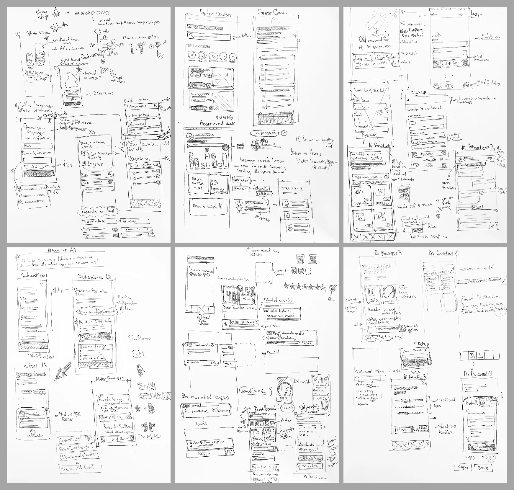
Before jumping into Figma to pick colors and fonts, I needed to define the skeleton of the app. I started with raw ideas on paper to quickly test different navigation patterns.
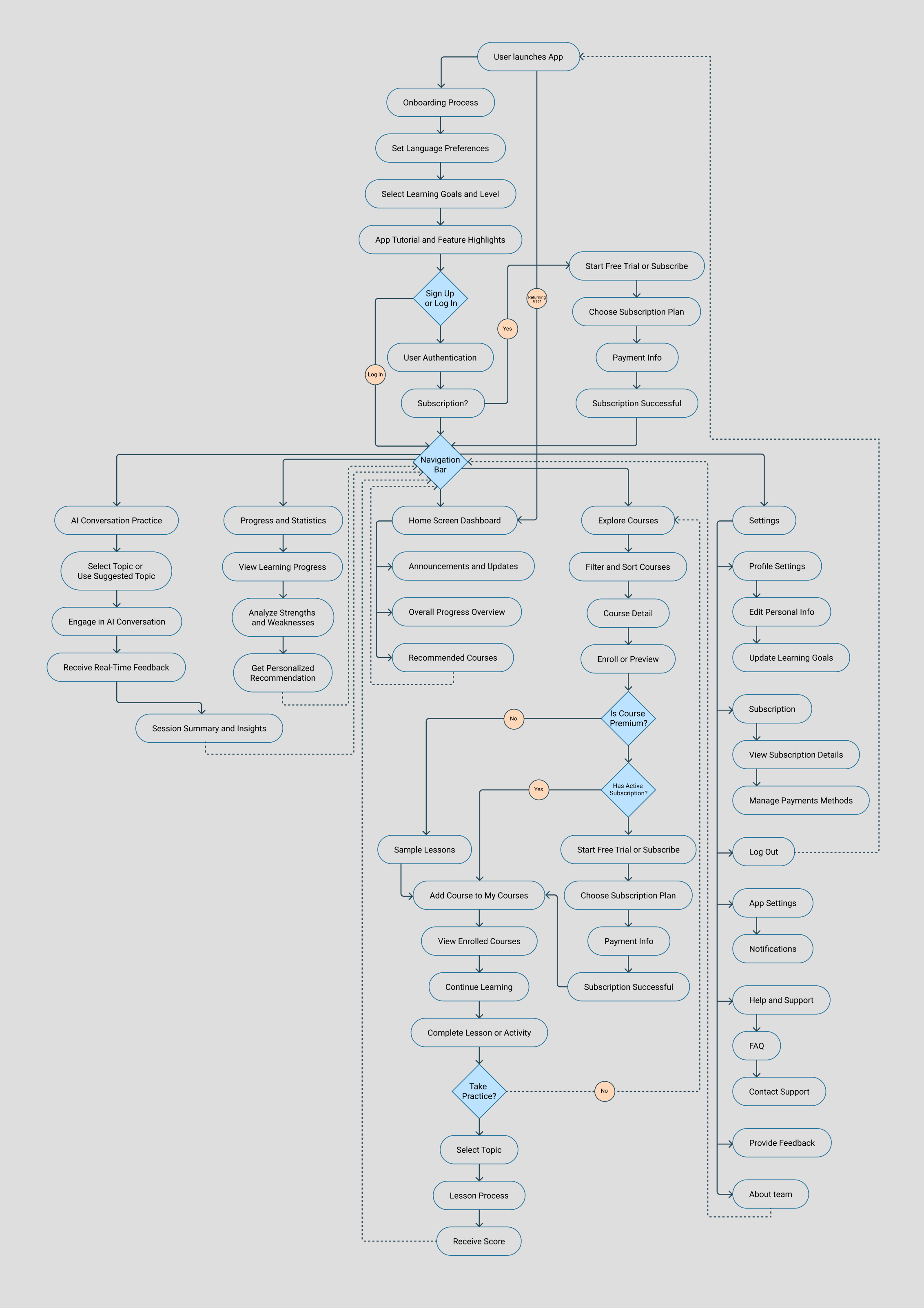
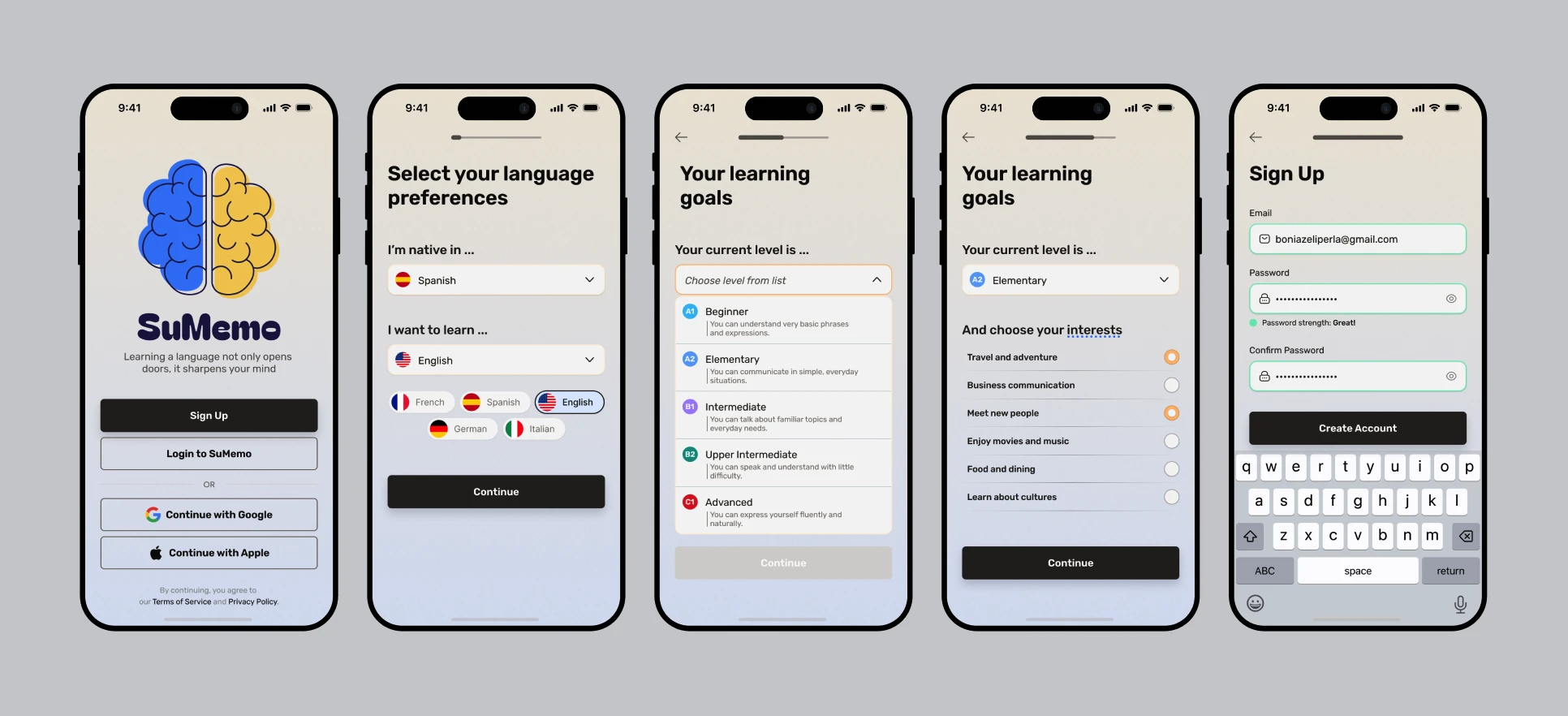
Once the general layout felt right, I built a detailed user flow to ensure there were no dead ends and that the core loops (like starting an AI chat or checking daily streaks) were as short as possible.
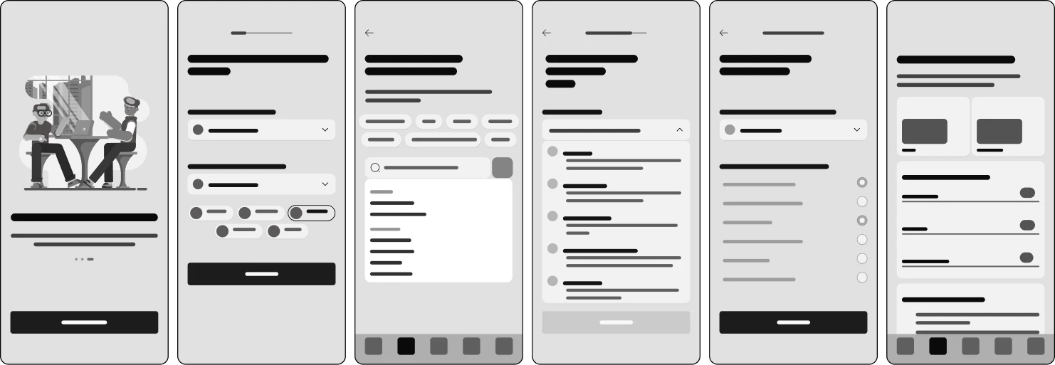
From there, I moved to early digital wireframes. This stage helped me lock in the visual hierarchy, grid, and content placement before getting distracted by the final aesthetics.
03 — Visual Identity & Final UI
How do you make an educational app engaging without making it look like a toy?
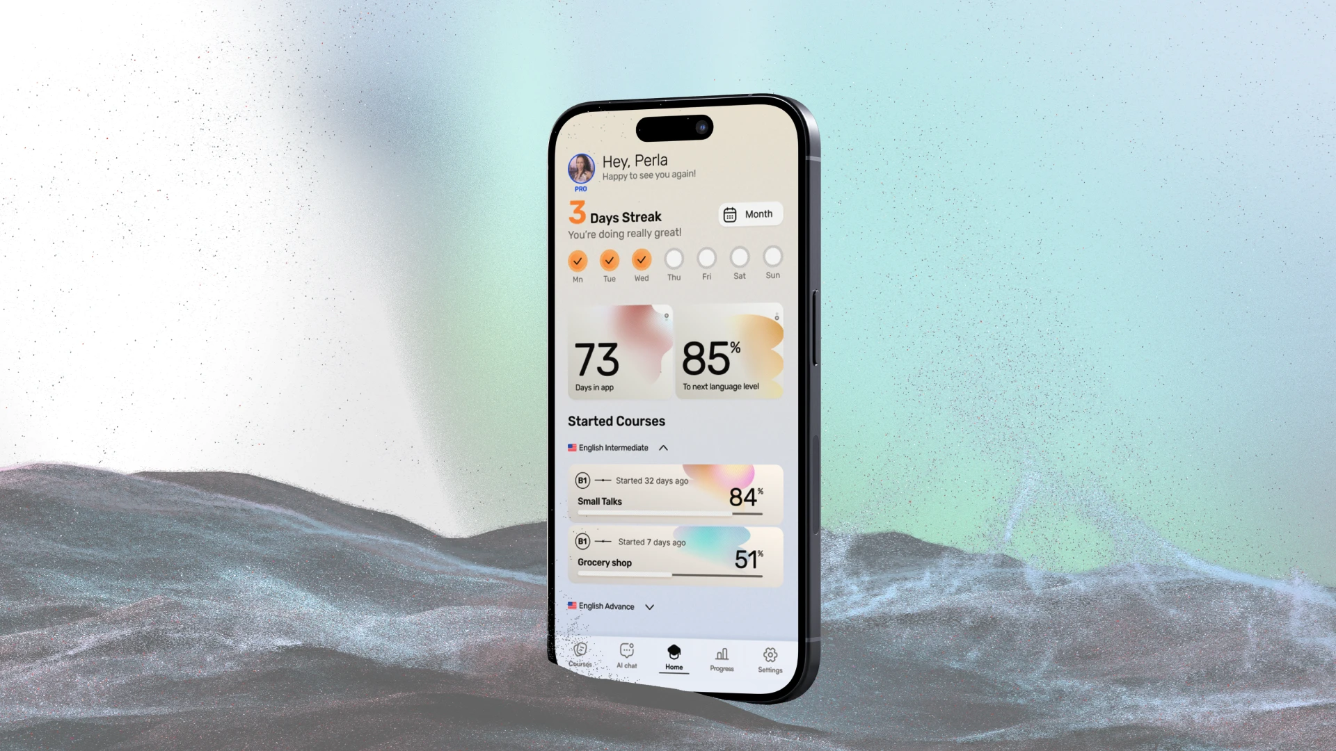
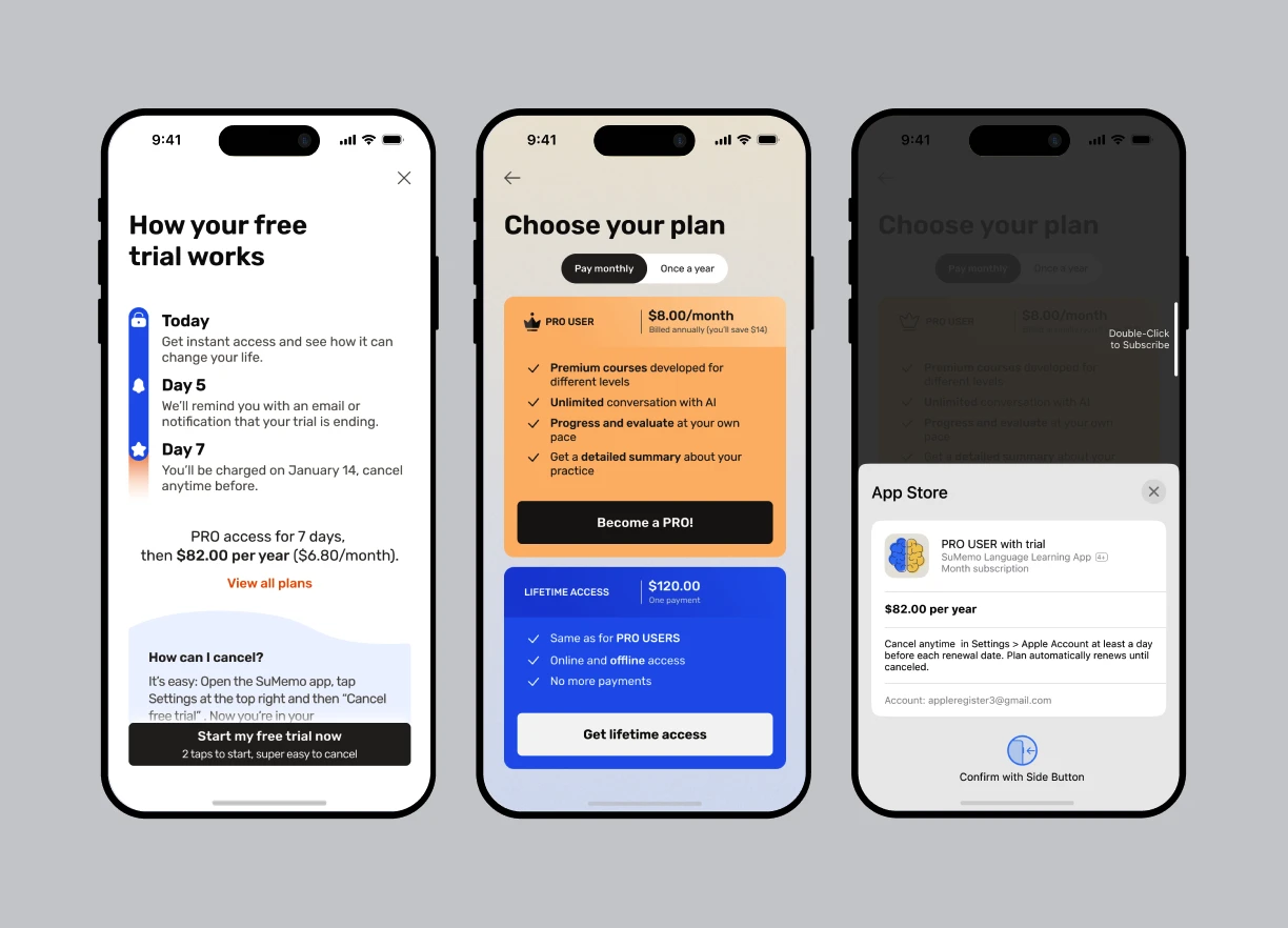
For the visual system, I aimed for a "modern editorial" vibe—vibrant enough to be motivating, but clean enough for adult professionals. I built the interface on a strict 2-column mobile grid (24px margins, 16px gutters) to ensure a balanced, breathable layout.
To keep users engaged, I focused on making the core features visually rewarding:
Feature Highlights
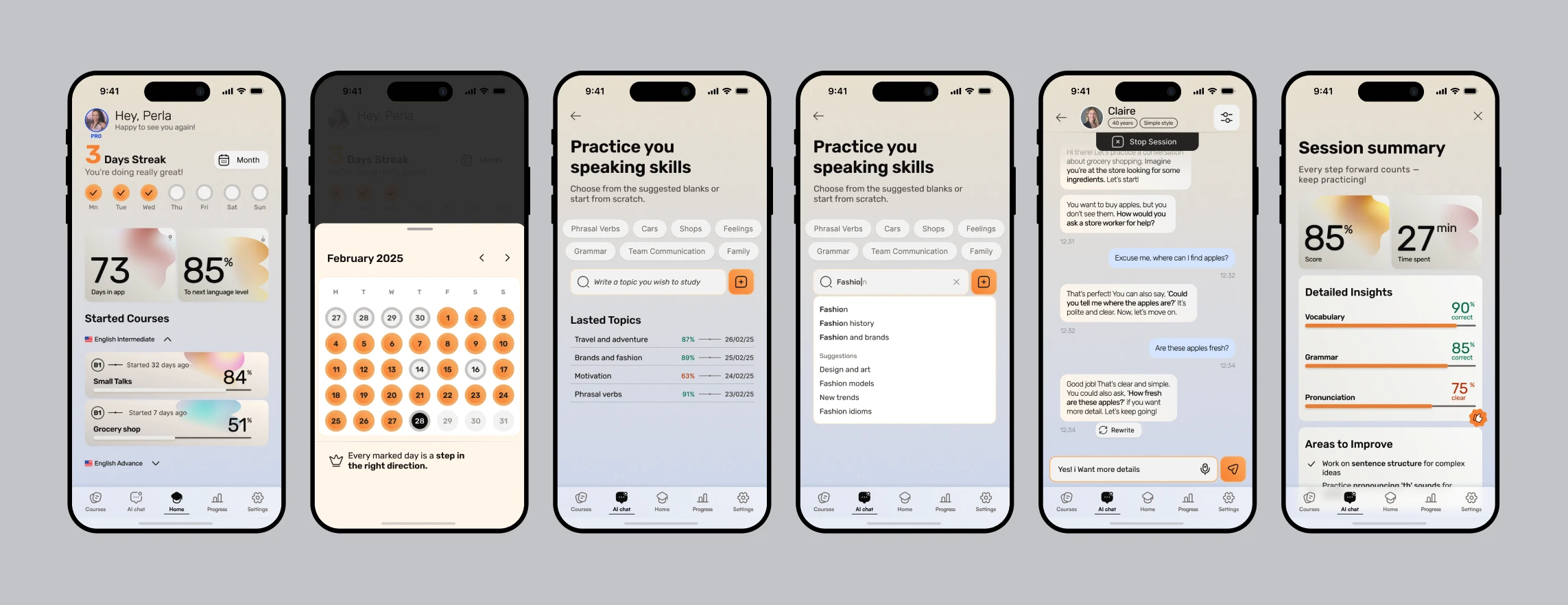
- ■Visualizing Progress: Using bright colors and clear charts, the dashboard provides positive reinforcement for daily check-ins.
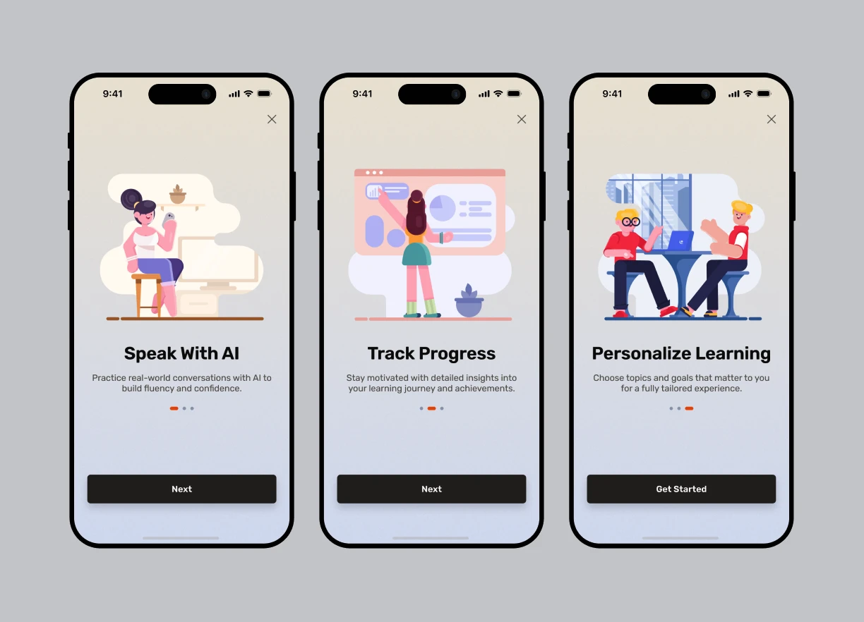
- ■Friendly AI Chat: I used a familiar messaging-style interface so users feel comfortable practicing real-life scenarios without the fear of making mistakes.


04 — Bringing it Together
To make sure the navigation actually felt intuitive and my "3-tap rule" worked in practice, I linked the core screens into a basic interactive prototype. It helped to validate the flow before finalizing the concept.
Outcome
- ↳This project was a great exercise in balancing visual aesthetics with usability.
- ↳By focusing on a clear grid, encouraging feedback loops, and intuitive interactions, I wanted to show that a learning app can feel less like a chore and more like a fun daily habit.