Landing Design
Four markets, four visual languages, one goal — conversion.
The Challenge
Each landing was shaped by its market: B2B buyers need efficiency, SaaS users need product proof, luxury brands sell lifestyle, and agencies sell results.
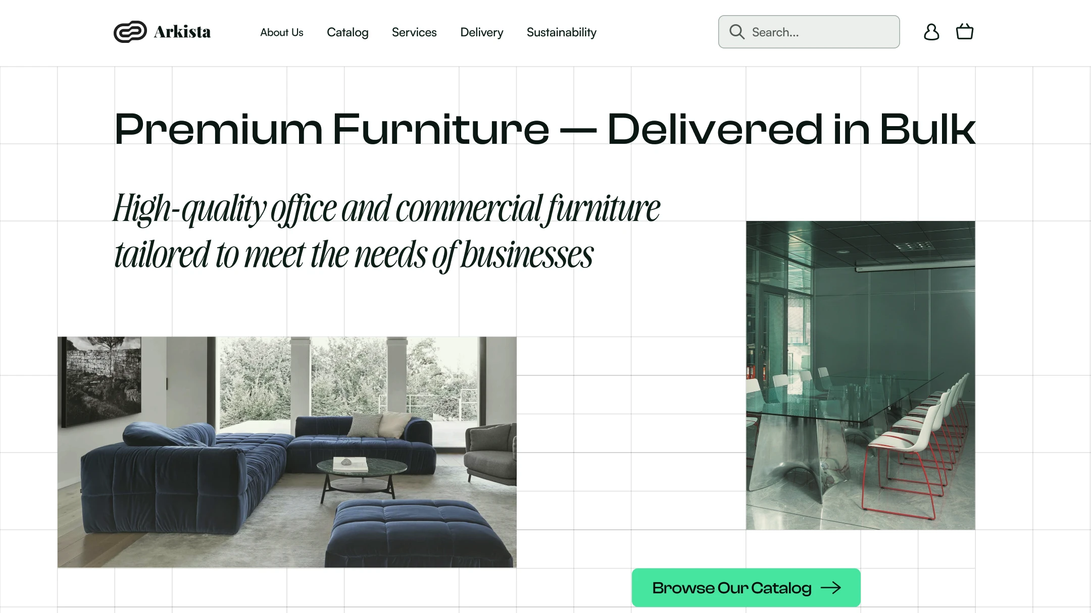
Arkista — B2B Wholesale Furniture
In the B2B sector, decisions are based on numbers and deadlines, not emotions. Buyers don't have time to browse inspiring catalogs — they need a quote.
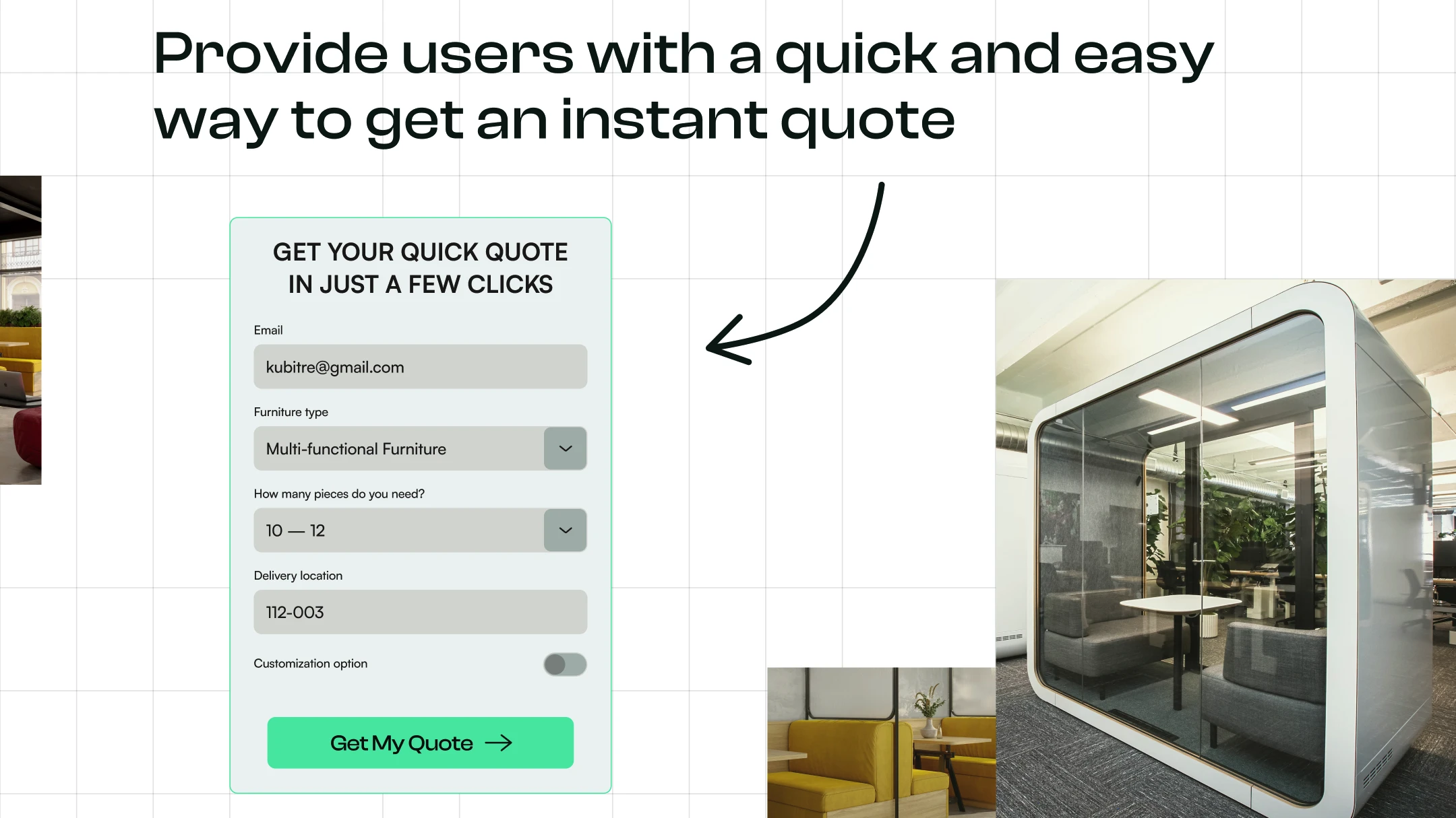
Zero-Friction UX: I embedded an "Instant Quote" widget directly into the first screen flow. Users don't need to visit a separate contact page to calculate costs.
Strict, mathematically precise grid with a mint accent color. The grid broadcasts reliability, accuracy, and a systematic approach — exactly what a business expects from a wholesale supplier.
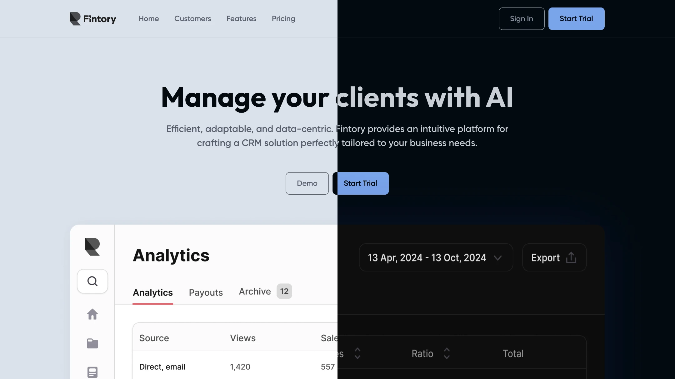
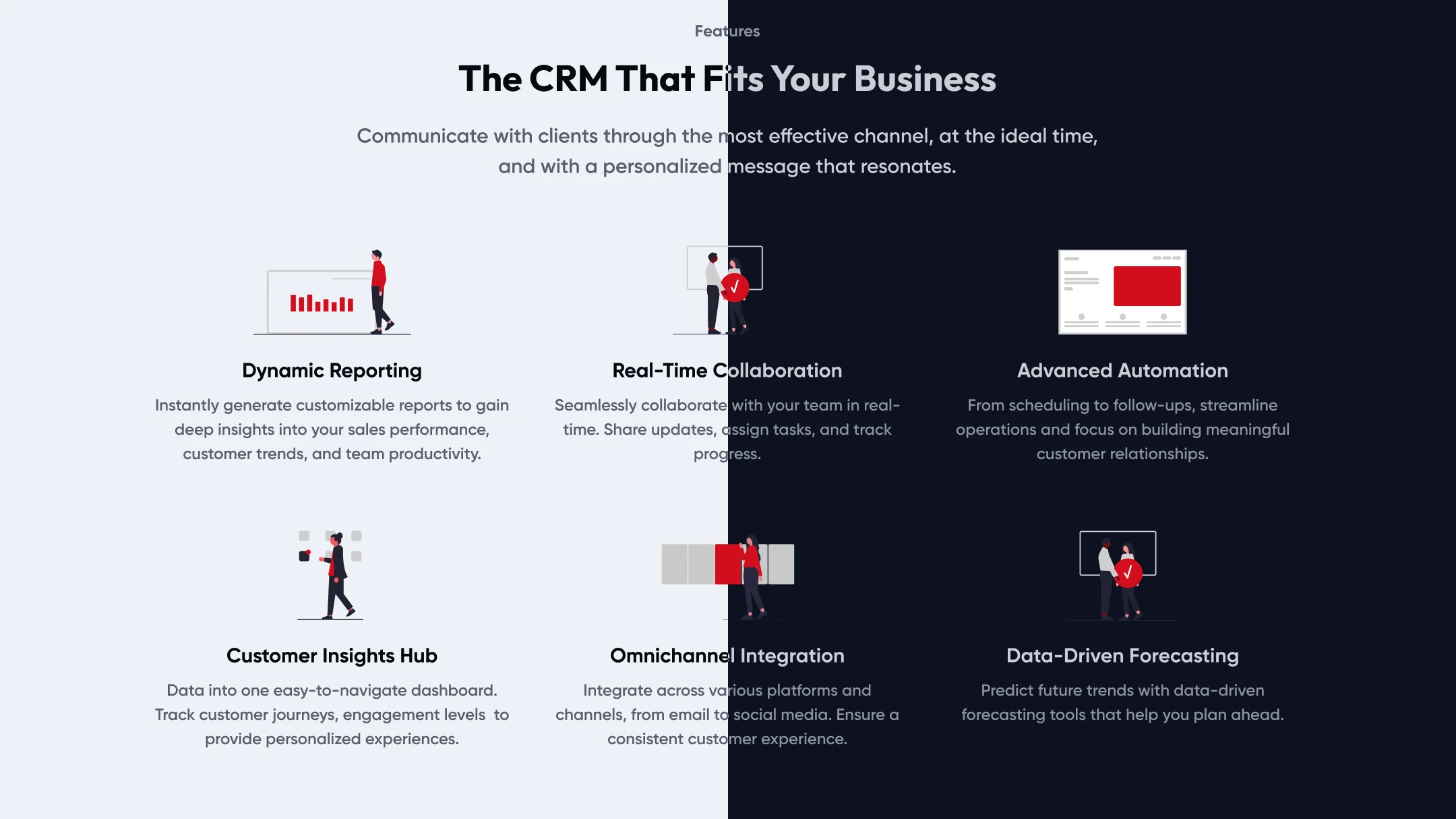
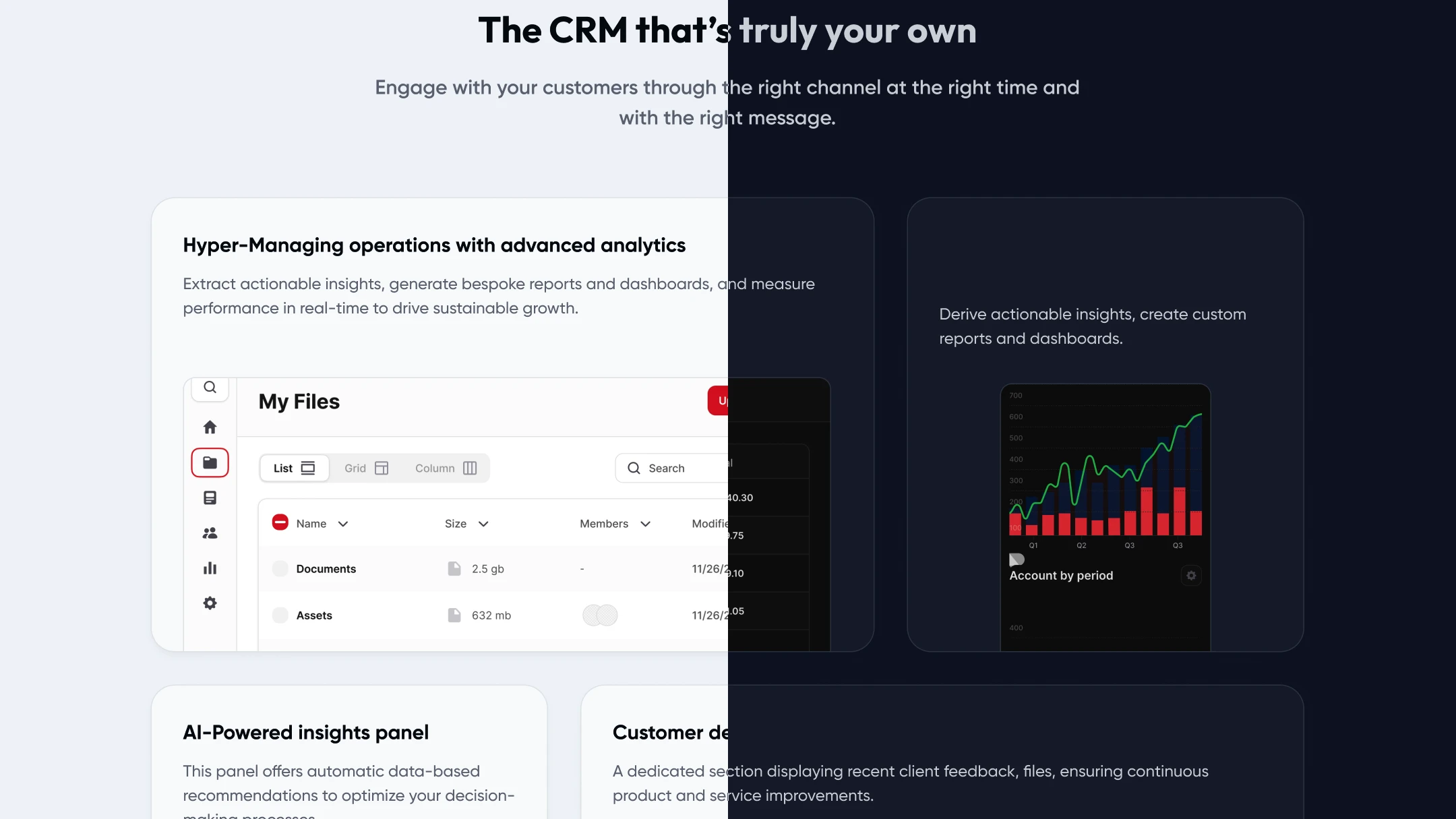
Fintory — SaaS CRM
Most SaaS landings are overloaded with abstract 3D illustrations, obscuring the actual product. Users want to know: "What does it look like inside?"
Product-Led Design: I brought the interface (dashboards, charts, analytics) directly onto the landing page. The user starts "using" the product before even registering.
Dark and Light theme (Split View). For a tech and developer audience, Dark Mode is a must-have. Integrations (Stripe, Salesforce) immediately close technical compatibility questions.
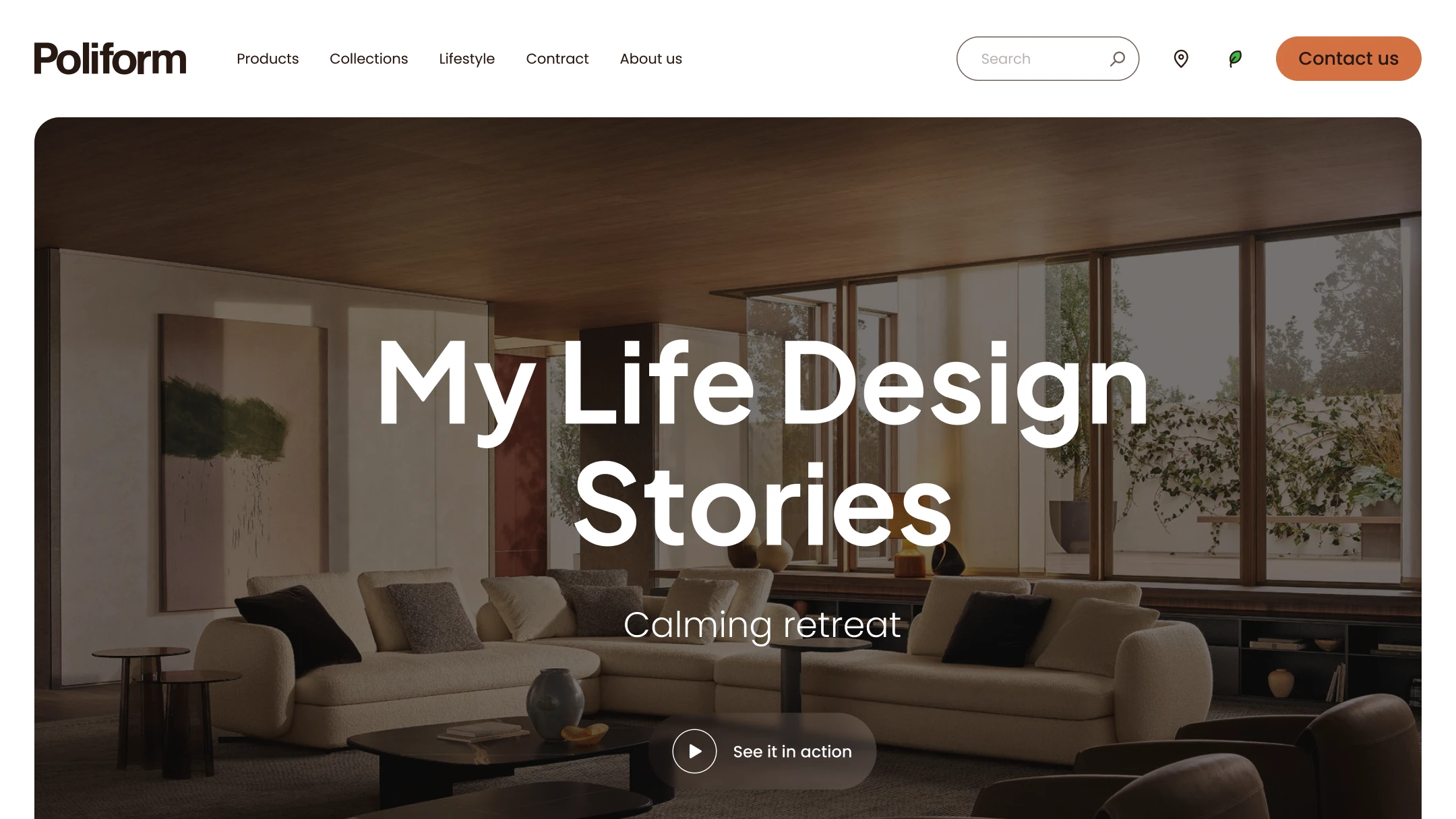
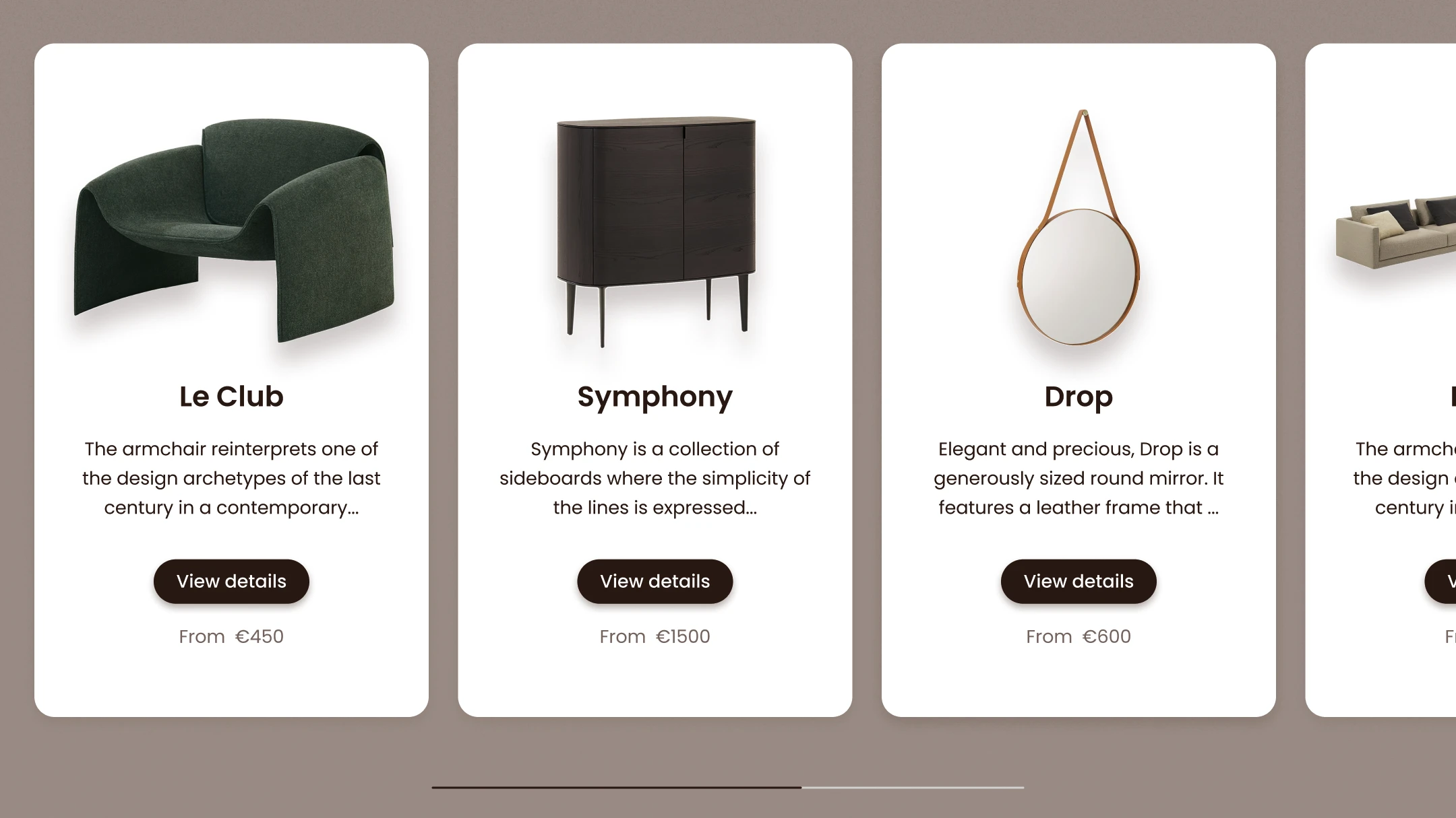
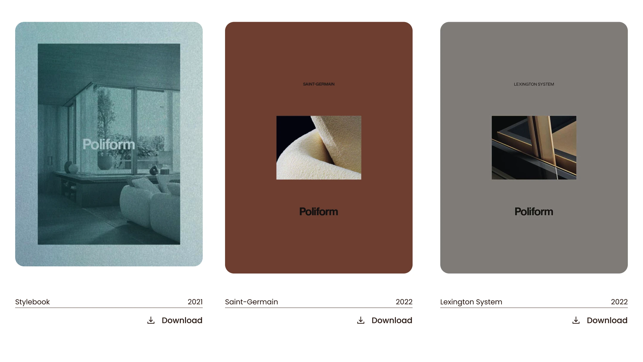
Poliform — Premium Furniture
Premium Italian furniture isn't sold through standard e-commerce grids. When a sofa costs as much as a car, you're selling lifestyle and status, not just furniture.
Editorial Experience: I stepped away from classic UI and designed the page like a spread in an expensive interior design magazine.
Plenty of "air" (negative space), calm earthy tones, and elegant serif typography. The user isn't scrolling a catalog — they're reading the brand's story.
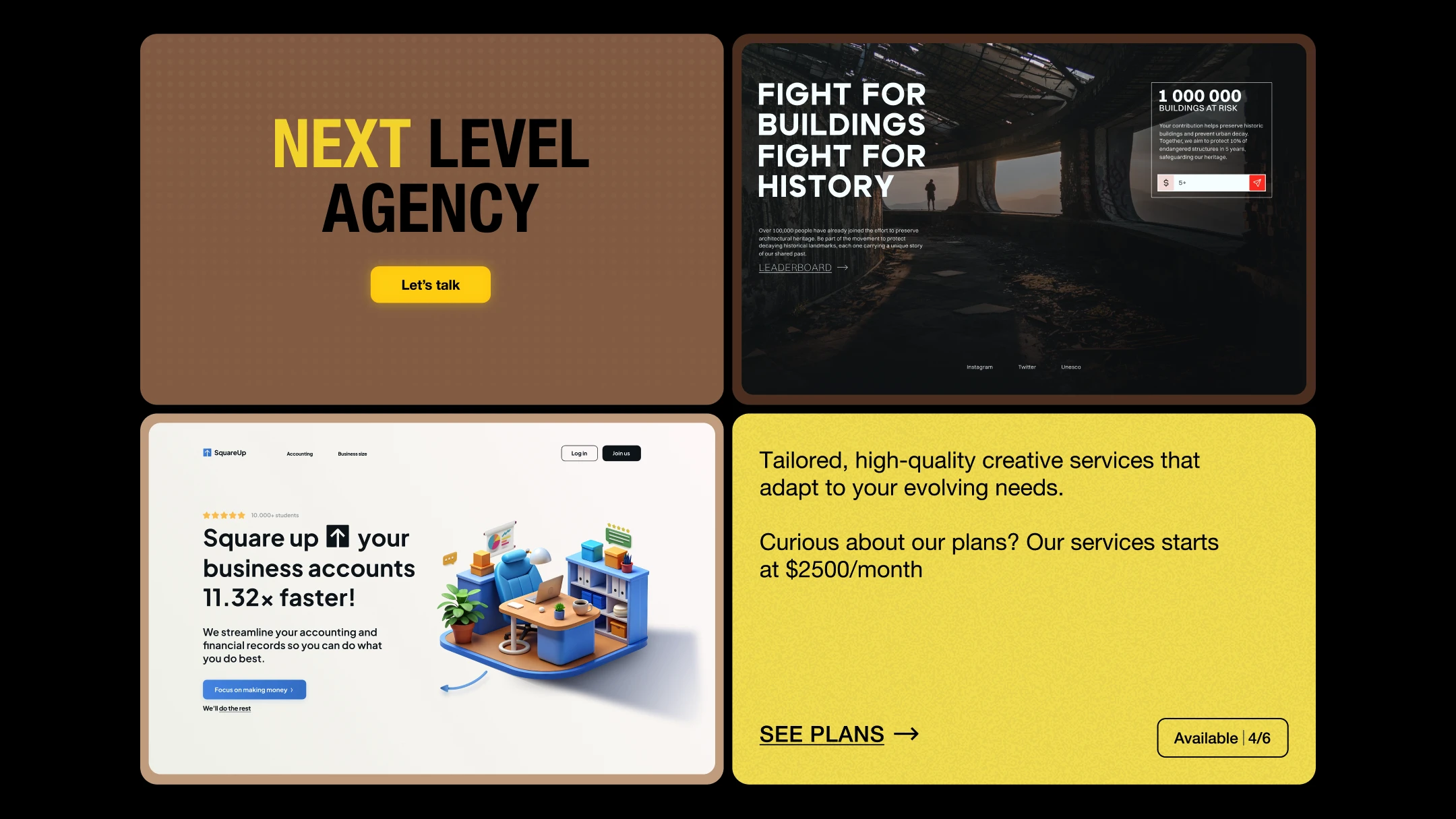
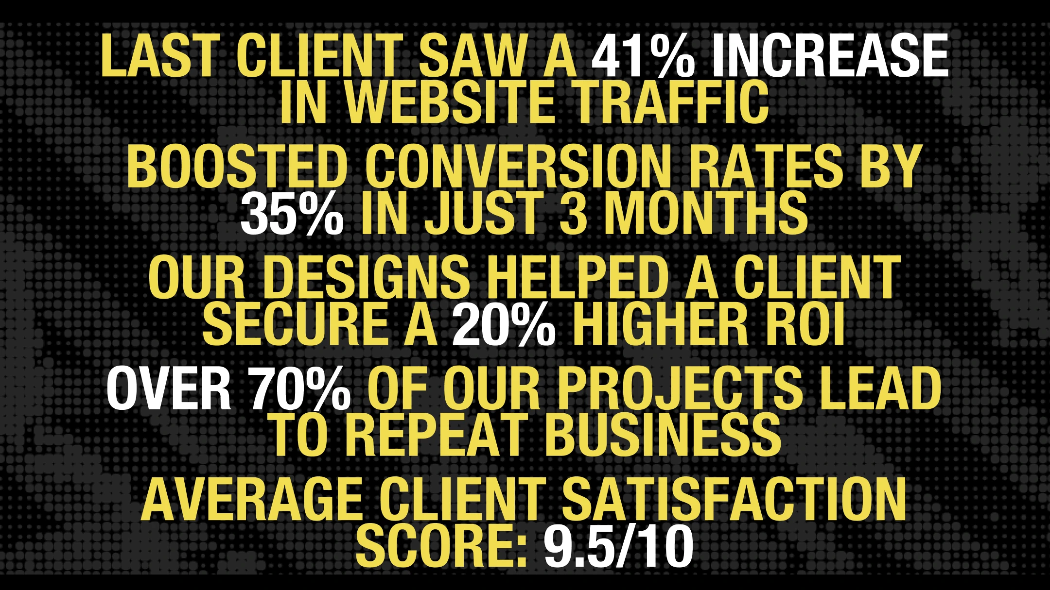
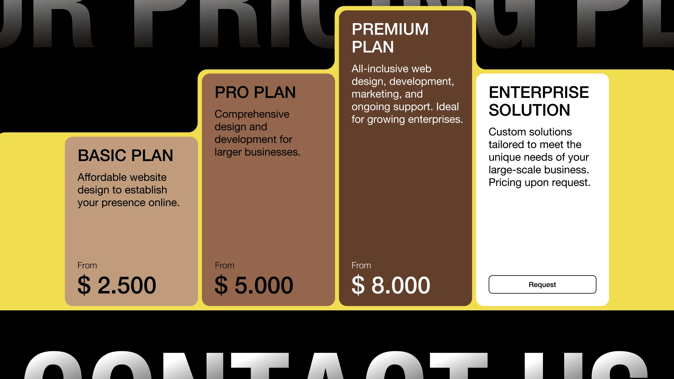
Next Level — Digital Agency
Creative agency websites often sell "creativity for the sake of creativity," forgetting the client's business goals.
Data-Driven Typography: massive, brutalist type filled with projected metrics — traffic growth, conversion lift — instead of abstract slogans.
Dark background with acidic yellow accents acts like a laser, guiding the user's eye strictly down the funnel: from numbers to projects, to pricing, and finally to the contact form.
Design Approach
- ↳Every landing starts with competitor analysis — understanding what already exists in the niche before deciding what to break.
- ↳References aren't for copying. They're for identifying patterns that work, then finding the gap between the expected and the unexpected.
- ↳A wireframe isn't a low-fi mockup — it's a conversion hypothesis. Every block answers: "What does the user need to see here to move forward?"
- ↳Visual language follows the audience, not trends. B2B and luxury require fundamentally different approaches to color, space, and typography.