English Courses
A Hybrid Learning App
The Challenge
The mobile language learning market is booming ($274M+), but it's dominated by a few massive companies and flooded with online-only clone apps. Through user interviews, I discovered a critical gap: beginners often feel online-only lessons aren't enough to make rapid progress. They need real-world, face-to-face practice, but finding a good local school is a separate, frustrating process. My goal was to design a hybrid app that offers interactive in-app lessons while seamlessly connecting users with offline language schools nearby.
Competitive Analysis: Finding the Sweet Spot
Before designing, I analyzed mid-level language apps on the App Store to understand why average apps fail and what keeps users engaged.
Key Insights
- ■The Good: Interactive features (puzzles, gamified level choices) drastically improve retention. Learning shouldn't feel like a textbook.
- ■The Bad: Many apps suffer from cluttered, non-intuitive navigation. More importantly, they lack basic accessibility features, making them hard to use for a diverse audience.
- ■The Strategy: Build a clean, highly accessible interface that reduces cognitive load, allowing users to focus purely on the learning material and finding a school.

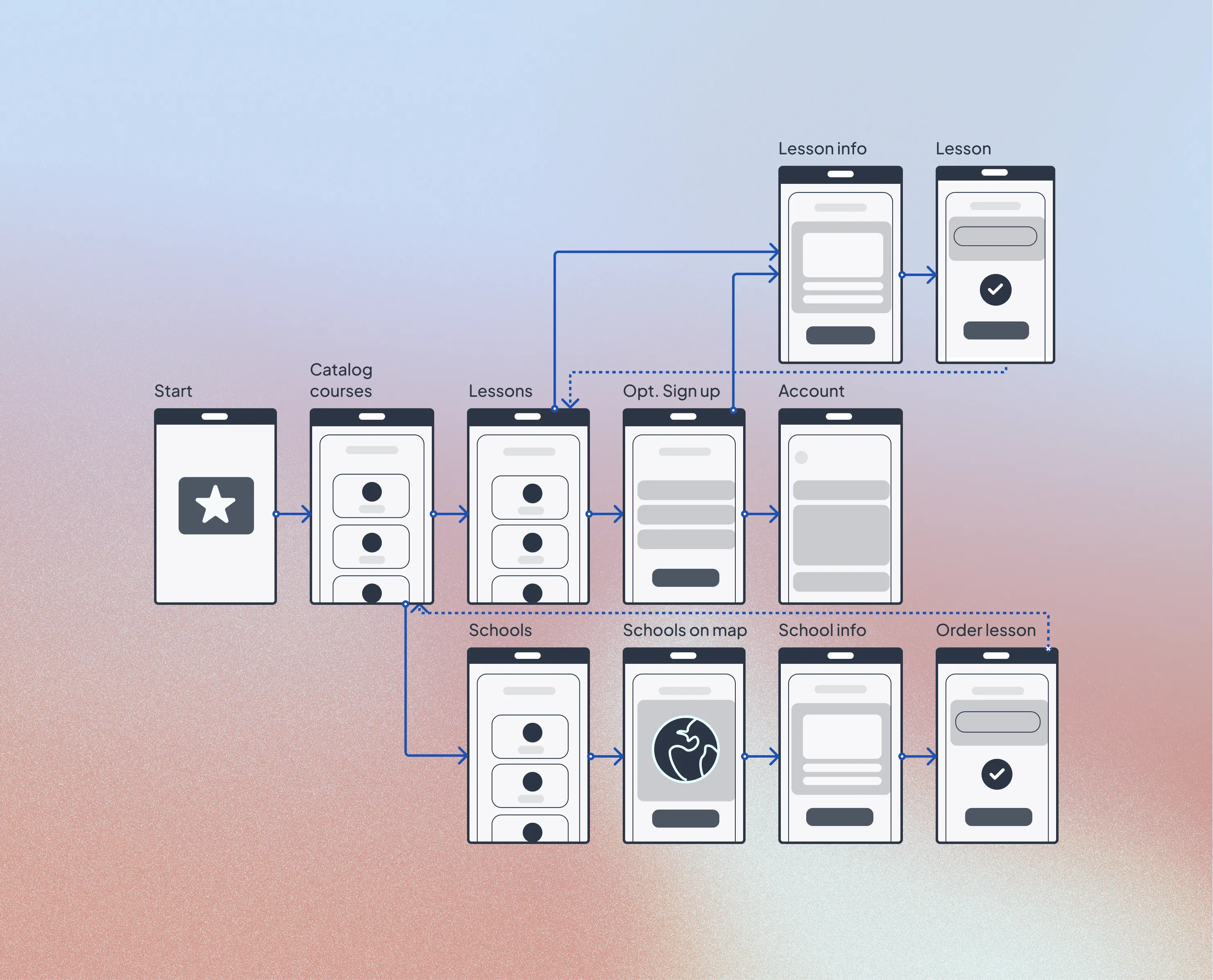
Structuring the Experience (The "Red Square" Method)
To solve the navigation issues found in competitors, I started with a strict Base User Flow, mapping out the journey from catalog browsing to booking an offline lesson.
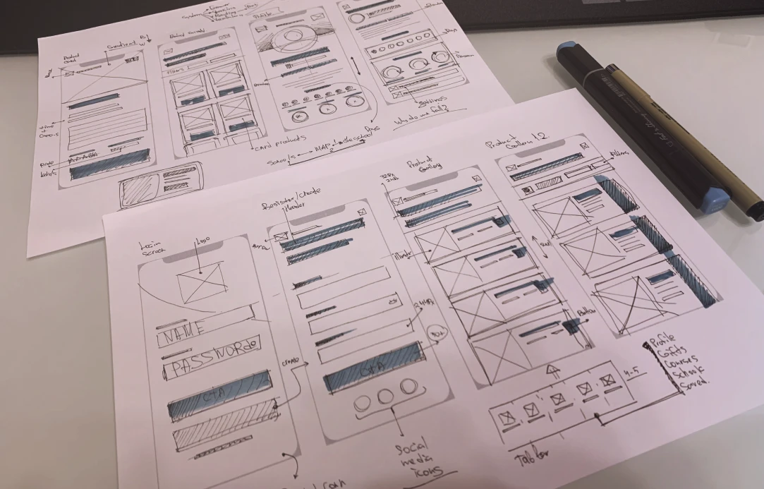
I always begin with paper sketches to conceptualize layouts quickly. Moving into digital wireframes, I utilized the "Red Square Method."
Instead of getting distracted by content and colors early on, I blocked out the UI using simple geometric shapes. This allowed me to test visual weight, layout hierarchy, and ergonomics before committing to the final aesthetics. Once the interaction flow felt intuitive, I transitioned to High-Fidelity.

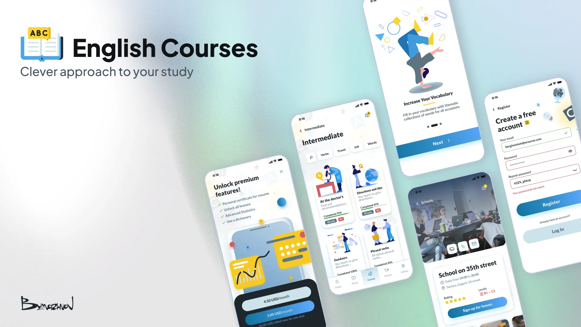
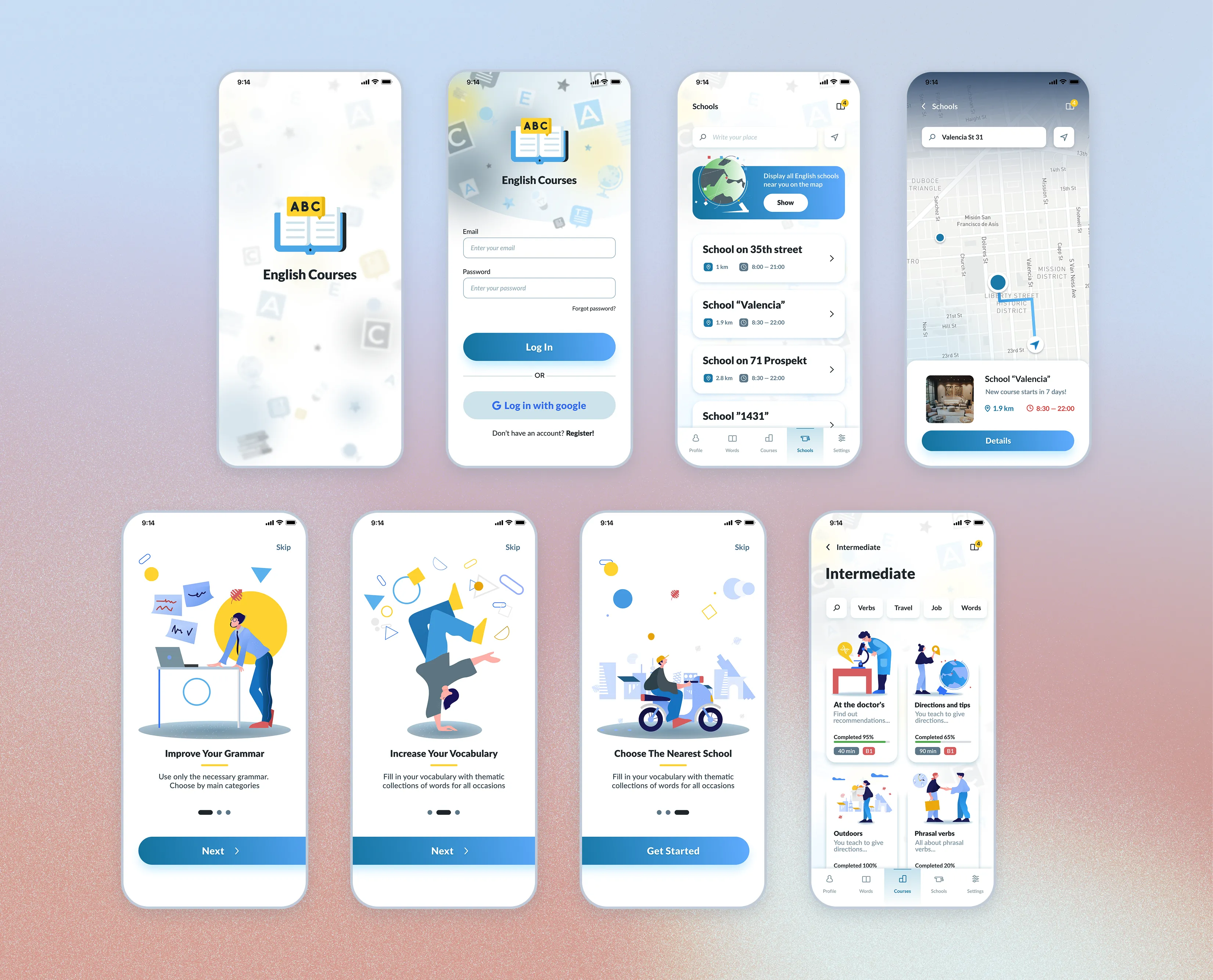
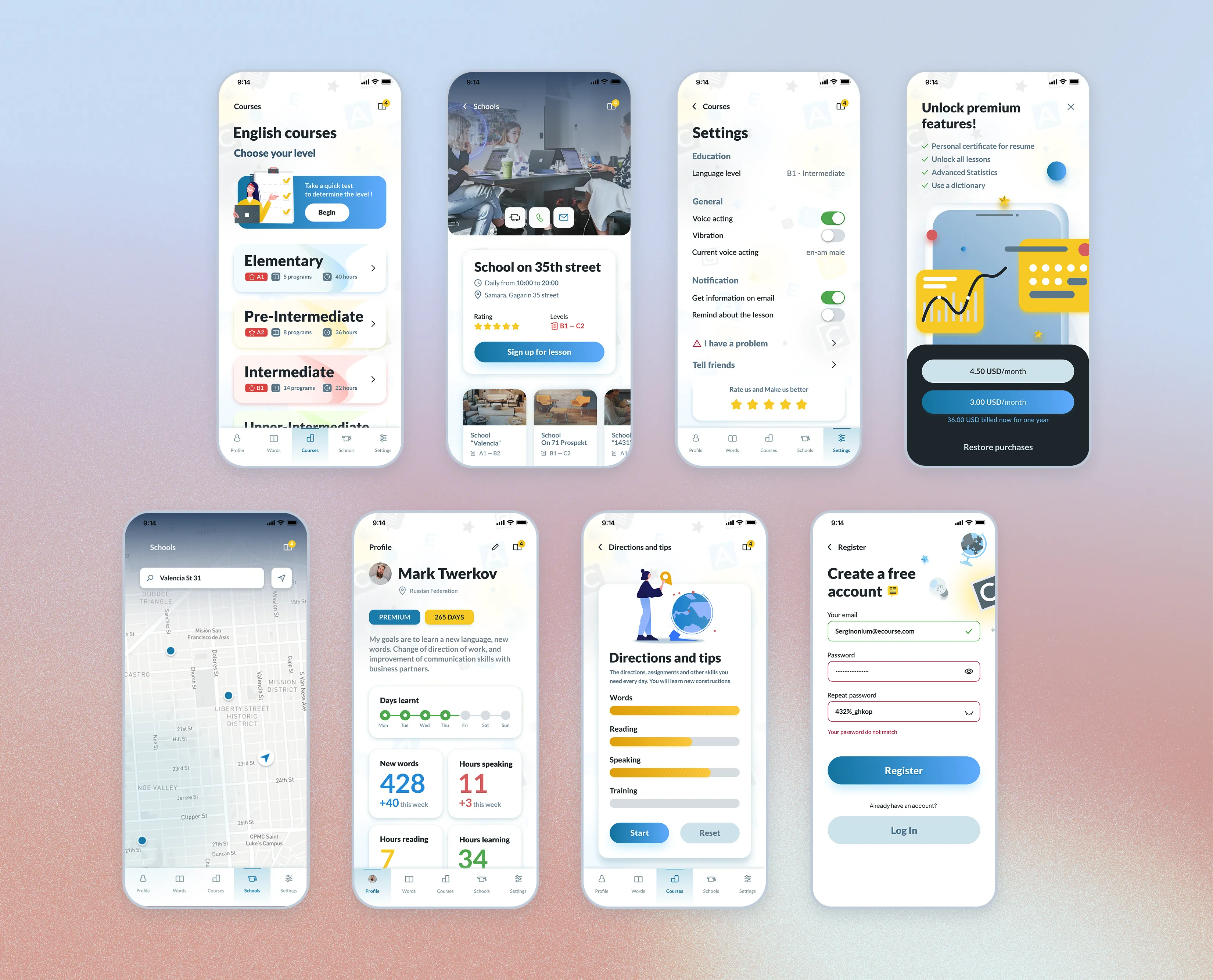
Final Interface
The visual identity needed to evoke trust, clarity, and energy. I anchored the palette with a reliable Main Blue #1A8CB7 and a motivating Yellow accent #FFD83D.
The final high-fidelity UI successfully merges two different user intents: completing daily interactive exercises and exploring an interactive map to book face-to-face classes.
Outcome
- ↳This project was a deep dive into balancing dual functionality (digital learning + physical booking). By strictly following the 8-point grid and prioritizing accessibility from the low-fidelity stage, I was able to create an interface that feels both powerful and welcoming to new learners.