EdTech Aggregator
From an overloaded directory to a high-converting, one-scroll lead engine.
The Challenge
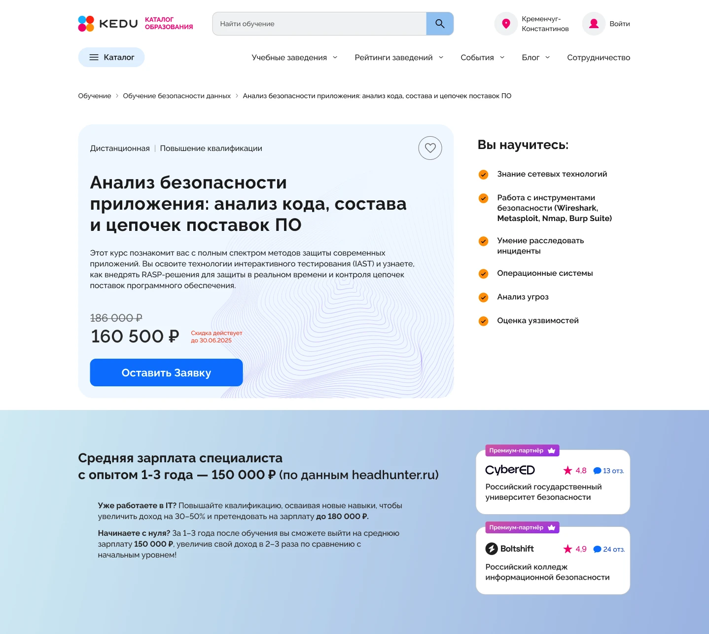
The client’s educational platform suffered from an identity crisis. It was trying to be a university catalog, an encyclopedia, and a sales page all at once. The result? Severe cognitive overload. The primary audience (a younger, fast-scrolling demographic) was losing patience and dropping off. Users wanted to know about salary boosts and practical skills, but that data was buried under formal documents and intrusive photos of university buildings. My goal was to conduct a ruthless heuristic audit, find the friction points, and deliver an evidence-based 'Fast Test Concept' to drive immediate action.
01 — The Friction Audit
Why was the funnel leaking? Before pushing any pixels, I tore down the existing interface. By mapping out the user’s cognitive load, it became obvious: the page demanded high effort for low immediate reward. The informational hierarchy was fighting against itself.
Critical flaws I identified
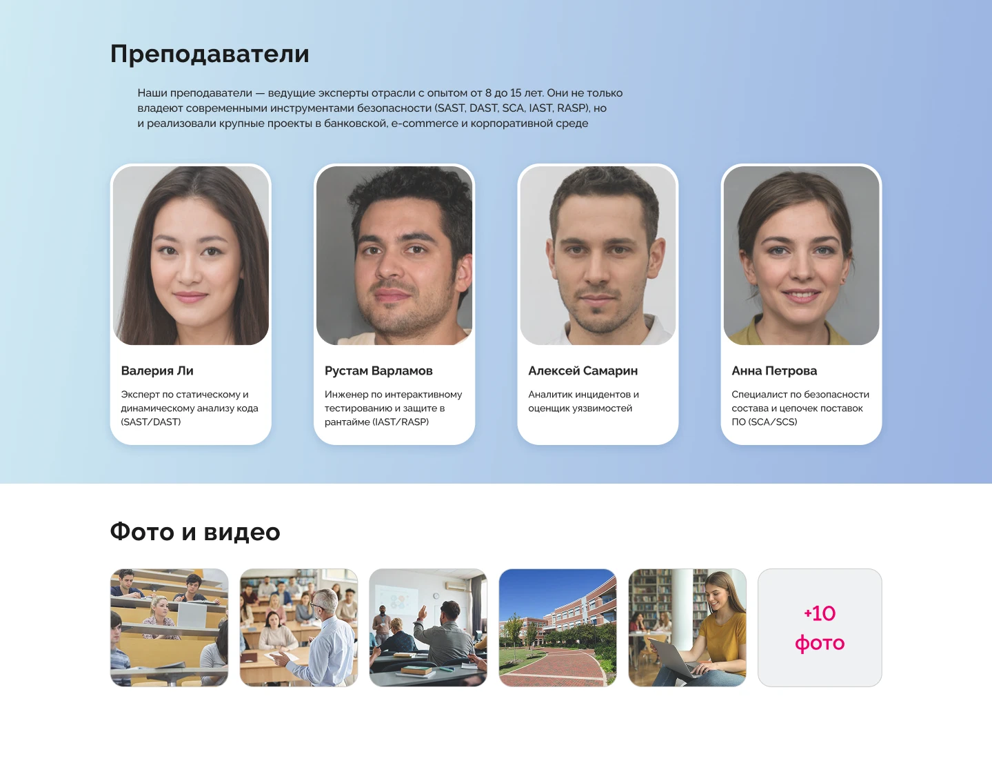
- ■Misaligned Value Proposition: Selling online courses using static photos of brick-and-mortar campuses.
- ■The Paradox of Choice: A massive cluster of secondary links and long breadcrumbs pulled users away from the main goal.
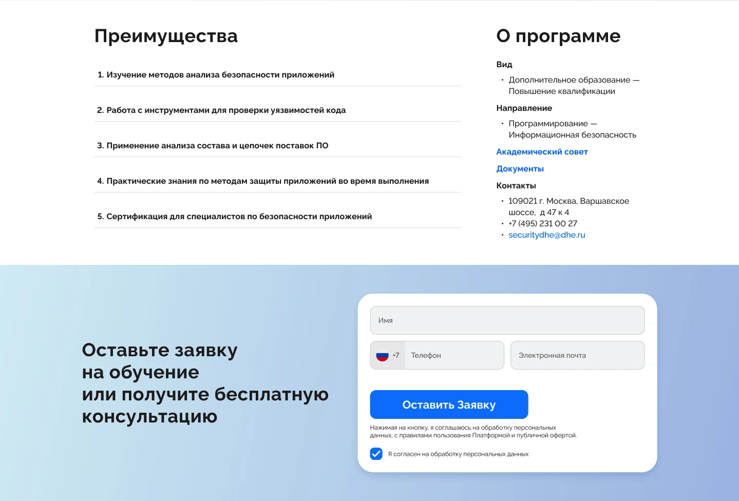
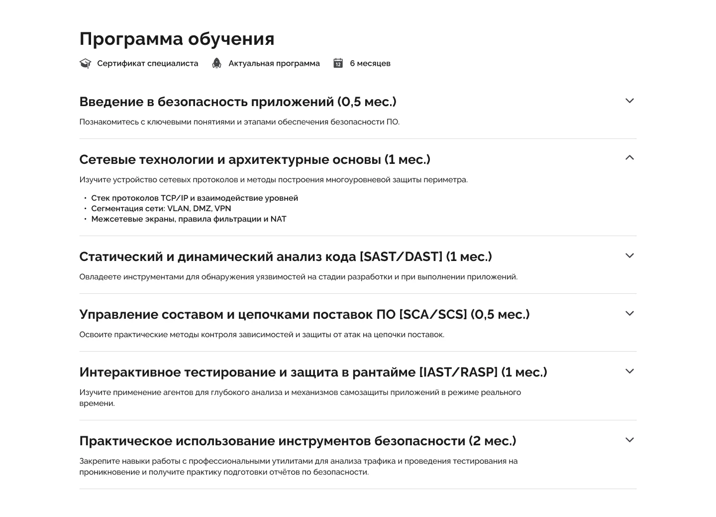
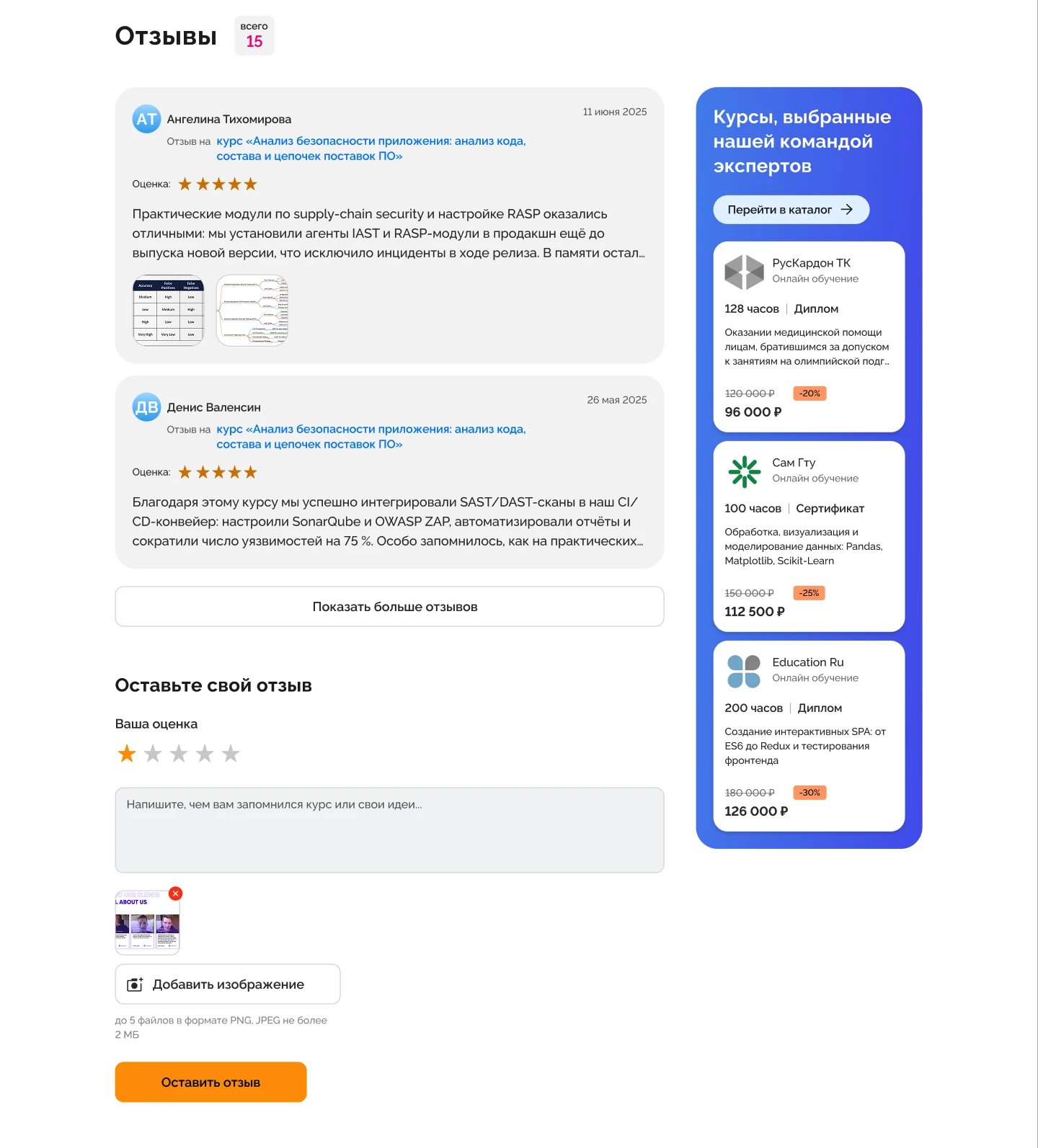
- ■Endless Scrolling: The "Course Program" block was a giant wall of text requiring multiple scrolls to pass.
- ■Aesthetic Friction: The primary CTA clashed with the brand identity, reducing trust. Formal, dry copywriting created emotional distance.
02 — UX Hypotheses & Strategy
Armed with a detailed heuristic audit, I mapped out 17 specific friction points across the page layout (detailed in the visual breakdown). To turn these findings into an effective redesign, I established a strict 'Problem → Hypothesis' framework. Every UI decision was treated not as a mere visual facelift, but as a testable bet to decrease friction and increase lead volume.
The core strategy was radical simplification. If a user is on the page to leave an application, they shouldn't have to wade through a messy directory. Below are the 4 core strategic shifts that drove the new 'One-Scroll' architecture:
Conversion-Driving Solutions
Progressive Disclosure
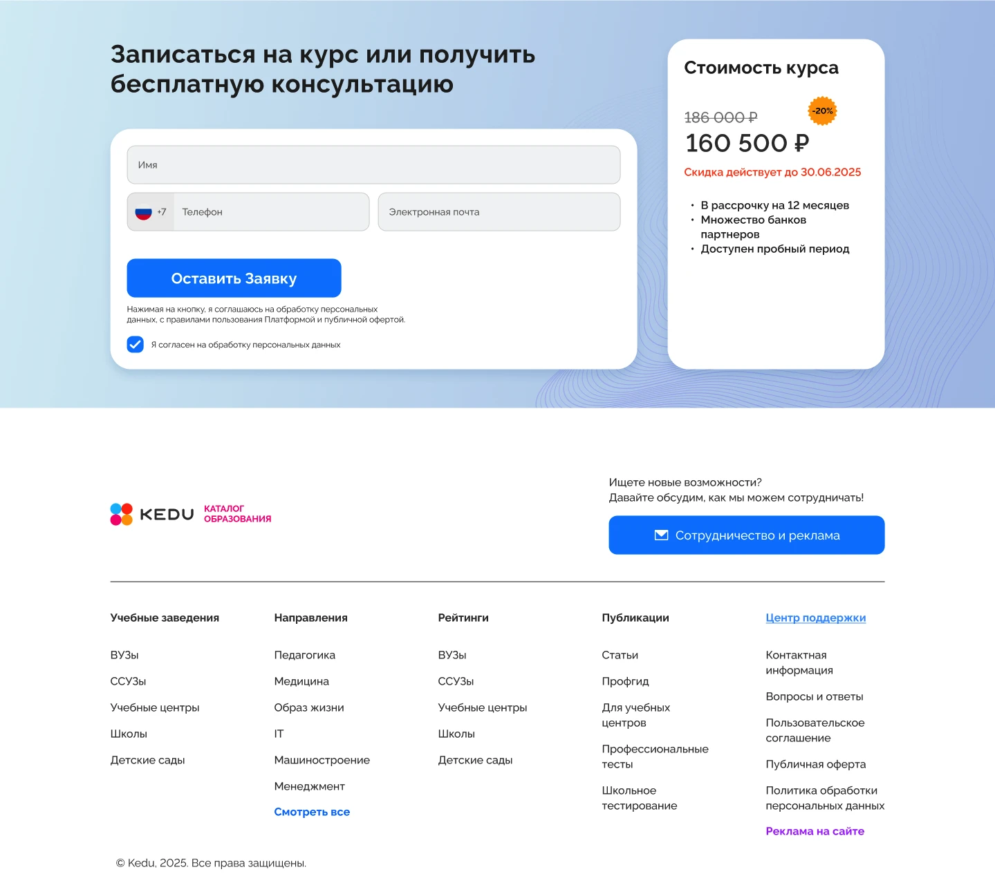
Streamlined Conversion
Value-Driven Architecture
Clean Monetization
03 — The "Fast Test" Concept
This deliverable was deliberately designed as a Lean UX concept. Instead of spending months building out a massive design system, the goal was to validate core business assumptions in the real world first. The new layout is a slick, organic pathway to the lead-capture form.
Outcome
- ↳Conducted a deep heuristic evaluation, pinpointing 17 distinct UX friction points that were killing conversion.
- ↳Moved from subjective aesthetics to objective CRO, creating a strict hypothesis framework for every UI change.
- ↳Architected a balanced layout, combining an aggressive lead-gen funnel on the left with un-intrusive ad monetization on the right.
- ↳Delivered a conversion-focused concept ready for immediate A/B testing against the original design.